From Dull to WOW #4: Color Recovery at Depth (Case Study)

Introduction: The Deeper You Go, The More Color You Lose
If you've spent any time shooting underwater, especially beyond 30 feet, you've seen this firsthand.
You descend into what appears to be a vibrant, colorful reef—beautiful and full of life…
You carefully frame your shot… press the shutter, and capture the image…
Only to open it later in Lightroom and see…
It's flat, blue, and lifeless.
That disconnect isn't your fault. It's rooted in physics.
Water absorbs light in a predictable pattern:
- Reds disappear first, usually within the first 10 to 15 feet
- Followed by oranges
- Then yellows as you go deeper
- What's left is mostly blue and green wavelengths.
So, when you review your RAW file, you're not seeing an accurate representation of your experience; you're seeing what the camera physically captured.
This is exactly where Lightroom becomes an incredibly powerful tool.
After thousands of dives and more than 50 years behind the camera, I can tell you this with certainty: this is where most underwater images fall apart, and where they can be completely transformed.
In this post, I'll walk you through a real-world case study, demonstrating step-by-step how I transform a dull, blue underwater photo into a vibrant, naturally colored image using a clear, structured workflow.
And I want to emphasize something important from the outset:
👉 Color recovery isn’t about simply increasing saturation.
👉 It’s about restoring the right balance, in the correct order, to achieve natural and appealing colors.
Now, let's dive in and explore how to make this happen.
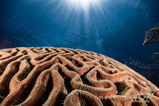
The Case Study: The Starting Image
 A real-world case study showing the transformation from a flat, blue RAW underwater image to a fully color-corrected result using a structured Lightroom workflow

What We're Working With
This image was taken:
- Depth: ~60 feet
- Lighting: Ambient light, minimal strobe fill
- Subject: Coral reef with diver in mid-frame
- Camera: Shooting in RAW
The Problems
Looking at this image, we can immediately identify:
- Strong blue/green color cast
- Complete loss of reds and oranges
- Low contrast
- Flattened tonal range
- Subject blending into the background
This is a perfect example of what most Oceanic Explorers struggle with.
Now let's fix it.
Step 1: White Balance (The Foundation of Color Recovery)
This is the crucial starting point for any successful underwater edit.
Before you begin adjusting exposure, presence, or color, you must deal with the blue or green cast that depth naturally introduces. If your white balance is off, every adjustment that follows is built on a weak foundation.
This is even more critical underwater because, as you descend, warm colors disappear in a predictable order. Reds go first, followed by oranges and yellows. What your camera captures is technically accurate for the available light, but it rarely matches what you experienced on the dive.
That is why I always start here.
Where to Find White Balance
In Lightroom Classic (LrC)
Go to the Develop module and open the Basic panel.
White Balance is at the top.
In Lightroom (cloud-based) v9.x
Open the image in Edit, then go to the Color panel.
White Balance controls are located there.
Keyboard Shortcuts
Lightroom Classic
- D = Go to Develop
- W = Activate the White Balance Selector
Lightroom (cloud)
- E = Edit view
- W = Activate the White Balance Selector (desktop)
How I Start the Edit
I begin by asking a simple question:
What part of this image should be neutral?
That might be:
- white sand
- a silver tank
- a gray fin
- part of a slate
- a neutral highlight on the wreck structure
If I have a believable neutral reference, I start with the White Balance Selector. If not, I go straight to manual adjustment.
My Typical Starting Approach
Step 1A: Try the White Balance Selector
Click on a neutral area and evaluate the result.
Sometimes this gets you close. Other times it pushes the image too warm or too magenta. That's completely normal with underwater files. You should expect to refine it.
Step 1B: Fine-Tune Temperature
After the eyedropper, I adjust Temperature to bring warmth back into the image.
At depth, this usually means pushing the image warmer than most photographers initially expect. A photo taken between 50 and 80 feet often requires a meaningful correction before coral, reef, and skin tones begin to look natural again.
Step 1C: Fine-Tune Tint
Next, I adjust Tint, usually toward magenta.
Underwater images rarely suffer from just a blue cast. There is almost always a green bias as well. Adjusting Temperature alone will not fully correct the image. Tint is what brings the color balance back into alignment.
Typical White Balance Adjustment Range
These are not hard rules, but they are common starting ranges for a deeper ambient-light image:
Lightroom Classic and Lightroom (cloud)
- Temperature: noticeably warmer than the original capture
- Tint: slight to moderate move toward magenta
The exact values don't matter. What matters is whether the image starts to feel believable again.
What I Am Looking For
At the end of Step 1, I am not trying to finish the image. I am setting the direction for everything that follows.
Here is what I want to see:
- The overpowering blue cast is reduced
- The green bias is under control
- Sand or neutral objects look believable
- The image feels more balanced, even if still flat
- Warm tones begin to reappear without looking forced
Important Underwater Editing Insight
This is where many photographers get frustrated.
They expect white balance alone to fully restore the image.
It won't.
White balance is the foundation, not the solution. At depth, some color information is heavily reduced or nearly gone. This step is about creating a believable starting point so the rest of the workflow works correctly:
White Balance → Exposure → Presence → Color → Masking → Final Adjustments
That order matters.
If you try to fix color loss by increasing saturation first, you'll almost always end up with unnatural water, strange coral tones, and an image that looks processed instead of polished.
My Rule for Step 1
I do not ask,
"Can I make this image colorful yet?"
I ask,
"Can I make this image believable enough so the next step works better?"
That is the goal of white balance.

Step 2: Exposure (Restoring Tonal Balance)
Once white balance is set, we adjust the light.
This is where the image starts to come back to life.
After correcting color, most underwater photos still look flat, underexposed, or lacking depth. That's normal. Your camera is working in a low-light, high-contrast environment, and it tends to protect highlights while letting shadows fall off.
Your job in this step is simple:
Restore a balanced tonal range without breaking the natural feel of the image.
Where to Find Exposure Controls
In Lightroom Classic (LrC)
Go to the Develop module → Basic panel
In Lightroom (cloud-based) v9.x
Open the image in Edit → Light panel
Keyboard Shortcuts
Lightroom Classic
- D = Develop module
- R = Crop tool (useful for horizon/level check during exposure work)
Lightroom (cloud)
- E = Edit view
- L = Lights Out mode (helps evaluate brightness and contrast)
How I Approach Exposure
I don't start by grabbing the Exposure slider and pushing it up.
Instead, I evaluate the image in this order:
- Overall brightness
- Highlight detail
- Shadow detail
- Contrast separation
Then I make controlled adjustments, not big swings.
My Typical Starting Adjustments
Step 2A: Set Overall Exposure
Adjust Exposure first to bring the image into a usable brightness range.
- Typical range: +0.3 to +0.7
This is not about making the image bright.
It's about making it readable.
Step 2B: Recover Highlights
Next, I bring down the highlights.
- Highlights: –20 to –50
This protects:
- sun rays
- reflective surfaces
- bright sand patches
Underwater highlights can clip quickly, especially near the surface, so this step preserves detail.
Step 2C: Open Shadows
Then I lift the shadows.
- Shadows: +30 to +60
This is where you start to reveal:
- reef texture
- structure detail
- subject separation
Be careful here. Too much shadow lift can flatten the image.
Step 2D: Set Whites and Blacks
Now I fine-tune contrast using Whites and Blacks.
- Whites: +10 to +25
- Blacks: –10 to –30
This creates separation between light and dark areas and gives the image depth.
What This Step Is Doing
At the end of Step 2, you should see:
- improved dynamic range
- better detail in both highlights and shadows
- more visual depth
- a cleaner tonal structure
But the image should still feel natural, not over-processed.
Pro Tip: Use the Histogram
Both Lightroom Classic and Lightroom (cloud) display a histogram at the top of the panel.
Use it.
- Watch for clipping on the right (highlights)
- Watch for crushed blacks on the left
- Aim for a balanced spread, not a perfect shape
The histogram is your objective reference when your eyes start to adapt to the image.
What I Am Looking For
At the end of this step:
- The image is no longer flat
- Details are visible across the frame
- highlights are controlled, not blown out
- shadows are open, but not washed out
- The image has structure, but not heavy contrast
Important Underwater Editing Insight
This is another place where photographers tend to overcorrect.
They push exposure too far, lift shadows too aggressively, or add too much contrast too early.
The result?
An image that looks artificial.
Underwater photos should still feel like they were taken underwater.
There should be a natural falloff of light, especially as depth increases.
My Rule for Step 2
I don't ask:
"Can I make this image bright?"
I ask:
"Can I make the light in this image feel natural and balanced?"
That is the goal of exposure.

Step 3: Presence (Adding Depth Without Overprocessing)
Now that color and exposure are in a good place, we start adding depth and definition to the image.
This is also where many underwater photographers go too far.
The Presence controls are powerful, but they are not subtle if misused. Small adjustments here can dramatically improve an image. Large adjustments can destroy it.
Your goal in this step is simple:
Enhance detail and separation without making the image look processed.
Where to Find Presence Controls
In Lightroom Classic (LrC)
Go to the Develop module → Basic panel
Look for:
- Texture
- Clarity
- Dehaze
In Lightroom (cloud-based) v9.x
Open the image in Edit → Effects panel
You will find:
- Texture
- Clarity
- Dehaze
Keyboard Shortcuts
Lightroom Classic
- D = Develop module
- Y = Before/After view (very useful in this step)
Lightroom (cloud)
- E = Edit view
- \ = Before/After toggle (desktop)
How I Approach Presence
I treat these sliders as refinement tools, not correction tools.
If your image still needs major fixing at this point, go back to White Balance or Exposure. Do not try to fix problems here.
Presence is about enhancing what is already working.
My Typical Starting Adjustments
Step 3A: Add Texture
Start with Texture.
- Typical range: +10 to +20
Texture enhances fine detail:
- coral structure
- reef patterns
- fish scales
This is usually the safest slider to start with.
Step 3B: Add Clarity
Next, adjust Clarity.
- Typical range: +5 to +15
Clarity increases midtone contrast, which helps:
- define edges
- separate the subject from the background
- add dimensionality
Be careful. Too much clarity creates a harsh, crunchy look, especially in water.
Step 3C: Apply Dehaze (Carefully)
Now use Dehaze, and this is where restraint matters.
- Typical range: +5 to +20
Dehaze helps:
- cut through water haze
- improve contrast
- add depth to the scene
But it also aggressively affects color and contrast.
What This Step Is Doing
At the end of Step 3, you should see:
- improved subject separation
- increased perceived sharpness
- better depth in the water column
- more definition in textures and edges
The image should feel clearer, not heavier.
The Biggest Mistake in This Step
Overusing Dehaze and Clarity.
This leads to:
- unnatural color shifts
- overly dark water
- harsh edges
- a "processed" look
If someone can tell you used Dehaze, you used too much.
Pro Tip: Watch the Water, Not Just the Subject
It's easy to focus on the coral or your subject and forget the background.
Always watch the water column while adjusting Presence.
- Does the water look natural?
- Is it getting too dark or too saturated?
- Are gradients still smooth?
If the water breaks, the image breaks.
What I Am Looking For
At the end of this step:
- The image has more depth and dimension
- Details are enhanced but not exaggerated
- The subject stands out more clearly
- The water still looks natural and smooth
- Nothing feels harsh or overdone
Important Underwater Editing Insight
Underwater images already contain natural softness due to water, particles, and light diffusion.
That softness is part of the environment.
If you remove all of it, the image no longer feels underwater.
Your goal is not to eliminate softness.
Your goal is to control it.
My Rule for Step 3
I don't ask:
"Can I make this image sharper or more dramatic?"
I ask:
"Can I add just enough definition to create depth, without losing the natural underwater feel?"
That is the goal of Presence.

Step 4: Color (Restoring What Depth Took Away)
Now we move from correction into transformation.
Up to this point, we've built a solid foundation:
- White balance has neutralized the color cast
- Exposure has restored tonal balance
- Presence has added depth and definition
Now we focus on what underwater photography struggles with most:
Recovering lost color in a controlled, believable way.
Where to Find Color Controls
In Lightroom Classic (LrC)
Go to the Develop module → HSL / Color panel
In Lightroom (cloud-based) v9.x
Open the image in Edit → Color → Mix
Keyboard Shortcuts
Lightroom Classic
- D = Develop module
- Shift + Tab = Hide panels (helps evaluate color cleanly)
Lightroom (cloud)
- E = Edit view
- C = Crop (useful for isolating the subject while evaluating color)
How I Approach Color
This is critical:
I do not adjust color globally first.
I do not grab Vibrance or Saturation and push everything up.
That's the fastest way to get:
- neon reefs
- radioactive blues
- unnatural skin tones
Instead, I work selectively, targeting the colors that were lost at depth.
The Goal of This Step
Not to make the image colorful.
But to make the color feel natural, balanced, and believable.
My Typical Starting Adjustments (HSL / Color Mix)
Step 4A: Restore Warm Tones (Reds, Oranges, Yellows)
These are the first colors lost underwater, so they need the most help.
Reds
- Saturation: +20 to +40
- Luminance: +5 to +15
Oranges
- Saturation: +15 to +30
Yellows
- Slight increase if needed, depending on the scene
This brings life back to:
- coral
- sponges
- fish
- skin tones
Step 4B: Control the Blues
Now we manage what's left over from depth.
Blues
- Saturation: –5 to –15
- Luminance: –10 to –25
This helps:
- prevent overpowering blue water
- create separation between subject and background
- deepen the water tone for a more natural look
Step 4C: Fine-Tune Greens (If Needed)
If your image has a strong green cast:
Greens
- Slight reduction in saturation
- Minor hue shift if necessary
This is especially useful in:
- murky water
- algae-heavy environments
- freshwater dives
What This Step Is Doing
At the end of Step 4, you should see:
- Warm colors were reintroduced into the image
- Better subject separation
- More natural color relationships
- Reduced dominance of blue/green tones
This is where the image starts to look like what you remember from the dive.
Advanced Tool: Point Color (Lightroom v9.x)
In Lightroom (cloud), you now have access to Point Color, which gives you precise control.
Instead of adjusting an entire color range, you can:
- Click directly on a coral, sponge, or subject
- adjust hue, saturation, and luminance for that exact tone
This is extremely powerful for:
- isolating problem colors
- refining specific subjects
- avoiding global color shifts
Pro Tip: Use Vibrance Carefully
If needed:
- Vibrance: +5 to +15
Vibrance protects skin tones and avoids oversaturation better than Saturation.
Avoid using Saturation globally unless absolutely necessary.
The Biggest Mistake in This Step
Trying to force color that isn't there.
At depth, some color information is simply gone.
If you push too hard, you get:
- unnatural reds
- muddy tones
- color noise
- "painted" looking images
Subtlety always wins.
What I Am Looking For
At the end of this step:
- Colors look believable, not exaggerated
- Warm tones are present but controlled
- The water color feels natural and consistent
- The subject stands out from the background
- Nothing looks artificially boosted
Important Underwater Editing Insight
Color recovery is not about saturation.
It's about balance.
You are rebuilding the relationship between colors that water has disrupted.
That requires restraint and control, not force.
My Rule for Step 4
I don't ask:
"Can I make this image more colorful?"
I ask:
"Can I restore the natural color balance without making it obvious I edited it?"
That is the goal of color.

Step 5: Masking (Selective Adjustments)
Up to this point, every adjustment we've made has been global.
Now we take control of the image.
Masking allows you to adjust specific areas instead of the entire frame, and this is where your subject starts to stand out, your background falls into place, and the image gains depth and direction.
This is where the edit becomes intentional.
Where to Find Masking Tools
In Lightroom Classic (LrC)
Go to the Develop module → Masking panel (circle icon)
In Lightroom (cloud-based) v9.x
Open the image in Edit → Masking
Keyboard Shortcuts
Lightroom Classic
- D = Develop module
- Shift + W = Open Masking panel
Lightroom (cloud)
- E = Edit view
- Shift + W = Open Masking panel (desktop)
How I Approach Masking
I keep this simple.
I am not trying to "fix" the image here.
I am refining what is already working.
Think of masking as:
Guiding the viewer's eye through the image.
My Core Masking Strategy
I almost always use some variation of these two masks:
- Subject Enhancement
- Background Control
That alone can dramatically improve most underwater images.
Step 5A: Select Subject (Primary Focus)
Tool:
- Select Subject (AI Mask)
Lightroom does a very good job of identifying your main subject, especially:
- divers
- fish
- large reef structures
My Typical Adjustments
Inside the Subject mask:
- Exposure: +0.2 to +0.5
- Temperature: slight warm shift if needed
- Clarity or Texture: small increase
- Saturation: very subtle boost if needed
What This Does
- pulls the subject forward
- increases visibility and detail
- separates it from the background
Step 5B: Select Background (Depth Control)
Tool:
- Invert the Subject mask, or
- Use Select Background
My Typical Adjustments
Inside the Background mask:
- Exposure: slight decrease
- Clarity: slight reduction
- Saturation: slight reduction
What This Does
- pushes the background back
- increases depth
- prevents distractions
Step 5C: Optional Refinements
Depending on the image, I may also use:
Radial Gradient
To create a subtle "spotlight" effect around the subject
Linear Gradient
To balance light falloff from top to bottom
Brush Tool
For fine control on:
- specific coral
- diver face or gear
- problem areas
What This Step Is Doing
At the end of Step 5, you should see:
- clear subject separation
- improved depth in the frame
- better visual flow
- less distraction from background elements
This is where the image starts to guide the viewer naturally.
The Biggest Mistake in This Step
Over-masking.
This leads to:
- obvious halos around subjects
- unnatural transitions
- patchy exposure and color
If you can clearly see the mask, it's too strong.
Pro Tip: Feathering and Subtlety
Always check your mask edges.
- Use feathering to smooth transitions.
- Zoom in and out while adjusting
- Toggle the mask on and off to compare
The goal is invisible control.
What I Am Looking For
At the end of this step:
- The subject naturally draws attention
- The background supports, not competes
- Transitions look smooth and realistic
- The image has depth and dimension
- Nothing looks artificially isolated
Important Underwater Editing Insight
Water naturally creates depth and separation.
Masking should enhance that, not replace it.
If you push masking too far, the image starts to feel like it was cut out and pasted together.
My Rule for Step 5
I don't ask:
"Can I make the subject pop?"
I ask:
"Can I guide the viewer's eye without them realizing I did anything?"
That is the goal of masking.

Step 6: Final Adjustments (Polish and Balance)
At this point, the heavy lifting is done.
- White balance is set
- Exposure is balanced
- Presence has added depth
- Color has been restored
- Masking has refined the image
Now we step back and polish the image as a whole.
This is where small adjustments make a big difference.
Where to Find Final Adjustment Tools
In Lightroom Classic (LrC)
-
Develop module
- Crop & Straighten
- Detail panel (Sharpening & Noise Reduction)
- Effects panel (Vignette)
In Lightroom (cloud-based) v9.x
-
Edit panels
- Crop
- Detail
- Effects
Keyboard Shortcuts
Lightroom Classic
- R = Crop & Straighten
- Z = Zoom
- \ = Before/After
Lightroom (cloud)
- C = Crop
- Z = Zoom
- \ = Before/After (desktop)
How I Approach Final Adjustments
This step is not about adding more.
It's about refining what's already there.
I go through this in a consistent order:
- Composition
- Sharpness
- Noise
- Subtle finishing touches
Step 6A: Crop and Straighten
Start with composition.
Even a strong edit can fall apart if the frame feels off.
What I Check
- Horizon level (especially in wide-angle shots)
- Subject placement
- Distractions near edges
- Overall balance of the frame
My Approach
- Use Crop tool (R or C)
- Keep it natural, avoid over-cropping
- Maintain resolution when possible
Step 6B: Sharpening (Add Detail, Not Harshness)
Now we refine the details.
In Both LrC and Lr
Typical starting settings:
- Amount: 40–70
- Radius: leave near default
- Detail: moderate
Critical Technique
Hold Alt/Option while adjusting the Masking slider.
This allows you to:
- Apply sharpening only to edges
- Avoid sharpening smooth areas like water
What This Does
- enhances subject detail
- keeps water clean and natural
- avoids noise amplification
Step 6C: Noise Reduction (If Needed)
Underwater images, especially at depth, often introduce noise due to:
- higher ISO
- shadow recovery
- color correction
My Approach
- Apply Luminance Noise Reduction carefully
- Avoid over-smoothing
- Preserve texture in coral and subjects
Key Balance
Too little = noisy image
Too much = plastic-looking image
Step 6D: Subtle Finishing Touches
This is optional, but powerful when used correctly.
Vignette (Effects Panel)
- Apply a very subtle vignette
Typical range:
- -5 to -15
What It Does
- gently draws attention to the center
- enhances subject focus
- adds a natural visual falloff
Important
If the vignette is obvious, it's too strong.
Final Check: Zoom Out
This is the most important part of Step 6.
Zoom out and evaluate the image as a whole.
Ask yourself:
- Does this look natural?
- Does it match what I experienced underwater?
- Does my eye go where I want it to go?
- Does anything feel overdone?
Before and After Review
Use Before/After (\) frequently.
Make sure:
- You improved the image
- You didn't over-process it
- The final result still feels believable
What I Am Looking For
At the end of Step 6:
- The image feels complete
- Nothing stands out as "edited."
- The subject is clear and well-defined
- The color and light feel natural.
- The image has depth, balance, and clarity
Important Underwater Editing Insight
The last 10 percent of an edit is where most photographers go too far.
They keep adjusting because they can.
That's when images start to break.
My Rule for Step 6
I don't ask:
"Can I make this image better?"
I ask:
"If I touch anything else, will I make it worse?"
If the answer is yes, I stop.
That is the goal of final adjustments.
At this point, your full workflow is locked in:
White Balance → Exposure → Presence → Color → Masking → Final Adjustments
This is how you consistently go from dull to WOW.


🎯 Want to Fix Your Underwater Photos Faster?
If your underwater photos still look blue, flat, or inconsistent, you're not alone. Every image you saw in this post followed the same structured workflow.
To help you get there faster, I've put together a free guide:
📘 10 Lightroom Fixes Every Underwater Photographer Should Know
This guide walks you through the exact adjustments I use to take photos from dull to WOW, step by step.
👉 Download the Free Guide Here
Final Thoughts
Every underwater photographer hits this wall at some point.
You take the shot…
You know it should look amazing…
But the Edit just doesn't get you there.
That's a workflow problem.
And once you fix the workflow, everything changes.
What's Next?
In the next post in this series, we'll take this even further:
👉 From Dull to WOW #5: Restoring Detail and Depth in a Flat Underwater Scene
🎁 CTA
Want my full step-by-step system?
👉 Grab the free guide:
“10 Lightroom Fixes Every Underwater Photographer Should Know.”
https://info.robertherb.com/lm-3
🌊 Take the Next Step
If this helped, the next step is to see it in action.
In my FREE Masterclass, I walk through this exact workflow step-by-step using real underwater images:
“Structure Before Drama: The Lightroom Workflow That Fixes Most Underwater Photos”
https://info.robertherb.com/lm-4-wait-list
📘 New here? Start with the full workflow:
The Complete Guide to Editing Underwater Photos in Lightroom
👉 https://robertherb.blogspot.com/2026/03/editing-underwater-photos-lightroom-guide.html
For those who want to go further, I also run small-group cohort sessions in which we apply this workflow directly to your images.
I’ll share details on upcoming sessions during the Masterclass.
👉 Want weekly tips like this delivered to your inbox?
https://info.robertherb.com/lm-2-blog
✍️Author
Written by Robert Herb
Empowering underwater photographers to capture and enhance the beauty of our oceans since 1978.
New blogs are published weekly with practical tips to help you transform your underwater photos from dull to WOW.
If you would like to go deeper, visit:
👉 www.RobertHerb.com
or reach out directly at: bob@robertherb.com
I always welcome your feedback and questions.
Bob Herb
|
|


Comments
Post a Comment
Please let me know your comments.