Back to Basics – Part 5D: Presence, Texture, Clarity & Dehaze: Adding Impact Without Overprocessing

👉
https://robertherb.blogspot.com/2026/03/editing-underwater-photos-lightroom-guide.html
There comes a point in every underwater photographer’s editing process when sliders start to feel like magic wands. A slight adjustment can make coral color pop, add depth to wrecks, or make light beams appear almost tangible. But push too far, and the image can quickly fall apart.
This is precisely the realm of Part 5D.
In this stage of the Lightroom workflow, tools like Texture, Clarity, and Dehaze can be game-changers, transforming an image from good to truly extraordinary. Underwater, these tools are especially potent because water naturally diminishes contrast, detail, and depth. However, wielded without care, they can also make images look overly harsh, noisy, or unnatural.
This lesson isn’t about indiscriminately cranking all the sliders to maximum. Instead, it’s about exercising control, understanding your intent, and knowing how these adjustments interact with water, light, and particles in your scene.
If Part 5C was about establishing a solid tonal foundation by tweaking Whites and Blacks, then Part 5D is about sculpting and refining the image without compromising its integrity. It’s about enhancing what’s truly there while maintaining a natural, cohesive look.

Where Part 5D Fits in the Back-to-Basics Workflow
Before we go any further, placement matters.
Presence tools should be used after:
Exposure is balanced
White Balance is corrected
Highlights, Shadows, Whites, and Blacks are set
Presence tools should be used before:
Sharpening
Noise Reduction
Grain
Final creative effects
This order isn't random. Texture, Clarity, and Dehaze each enhance contrast in unique ways. If you sharpen too early or denoise too soon, you may end up fighting artifacts you unintentionally created.
In simple terms:
Get the image right first. Then enhance it.
What “Presence” Really Means Underwater
In Lightroom, the Presence section helps you fine-tune how you perceive the details, contrast, and atmosphere in your photos. It doesn't actually change the image's sharpness.
Underwater, presence tools compensate for:
Light scatter
Suspended particles
Loss of red wavelengths
Reduced micro-contrast with depth
But water is not air. These tools behave more aggressively underwater than topside, especially in:
Green water
Low-visibility environments
High ISO images
Backlit scenes
Presence tools shape tonal contrast and micro-detail, while sharpening only enhances edges. If you sharpen first, you end up sharpening problems you haven’t solved yet.
This is why Part 5D stands out as one of the most essential lessons in the entire Back-to-Basics series.
Texture: Fine Detail Without Edge Harshness

Texture adjusts the amount of mid-frequency detail, helping to bring out fine surface features. It enhances these subtle details without altering edge sharpness.
Think of Texture as:
Scales on a fish
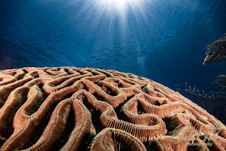
Polyps on coral
Rust patterns on a wreck
Skin texture on a turtle
It is not designed for:
Blue water
Open backgrounds
Smooth gradients
Why Texture Is So Useful Underwater
Underwater images often appear slightly soft, even when properly focused. This isn’t necessarily due to a lens problem. Water tends to absorb contrast at small scales, but using texture can help recover the lost detail without making edges look harsh or unnatural.
When Texture Works Best
Macro photography
Close-focus wide-angle
Wreck details
Coral heads
Crustaceans and nudibranchs
When Texture Works Against You
Blue water backgrounds
Diver portraits
High ISO images
Murky or particulate-heavy scenes
Applying texture across the entire scene in these situations can lead to increased noise and visual clutter more quickly than you might anticipate.
Recommended Starting Ranges
Macro subjects: +5 to +20
Close-focus wide-angle: +5 to +15
Wreck details: +10 to +20
Diver portraits: 0 or negative values
Always zoom to 100 percent when evaluating Texture. What looks subtle when zoomed out may already be too much.
Clarity: The Most Misunderstood Slider in Lightroom

What Clarity Actually Does
Clarity enhances the contrast in the midtones, making the differences between tones more noticeable. It doesn't sharpen the edges of objects, but it does increase the separation between midrange tones, resulting in a clearer, more distinct image.
This is why Clarity:
Adds perceived depth
Makes structures feel more three-dimensional
Can quickly make images look gritty
Why Clarity Is Dangerous Underwater
Underwater environments are full of midtones:
Blue water
Green water
Sand
Silt
Backscatter
Clarity enhances contrast between tones, making them easier to distinguish. However, this also means that it can make certain elements more visible, elements you might have preferred to keep hidden.
When Clarity Shines
Wreck interiors
Caverns
Rock formations
Silhouetted reef structures
Architectural elements
When Clarity Should Be Minimal or Avoided
Wide open blue water scenes
High backscatter environments
Portraits of divers
Skin tones
Recommended Starting Ranges
Wrecks and structures: +5 to +15
Reef scenes: +5 to +10
Blue water backgrounds: 0 or negative
Portraits: 0 or slightly negative
A good habit is to push Clarity until you notice it, then pull it back by about half.
Dehaze: The Underwater Power Tool

What Dehaze Really Does
Dehaze is not just contrast. It is a combination of:
Contrast adjustment
Saturation boost
Shadow compression
Highlight recovery
This is why Dehaze feels like magic and why it can destroy an image just as quickly.
Why Dehaze Works So Well Underwater
Water creates haze. That is literally what you are shooting through.
Dehaze helps:
Cut through green water
Improve wreck visibility
Enhance light rays
Restore depth separation
The Dark Side of Dehaze
Dehaze also:
Increases noise
Darkens shadows
Can oversaturate blues and greens
Amplifies backscatter
This is why Dehaze should generally not be applied aggressively, nor should it be the first slider you adjust.
Recommended Starting Ranges
Green water: +5 to +20
Wrecks and caverns: +5 to +15
Blue water: +3 to +10
Clear tropical water: often unnecessary
Negative Dehaze can be a useful tool not only for enhancing images but also for softly diminishing harsh backgrounds or reducing overly contrasty water columns, making your photos look more balanced and visually appealing.
Using Presence Sliders Together (This Is Where Experience Matters)

Texture, Clarity, and Dehaze do not work in isolation; they work together.
Making small adjustments to all three often yields better results than making a single large adjustment.
Example approach:
Texture +8
Clarity +6
Dehaze +5
This creates subtle enhancement without screaming “edited.”
A common beginner mistake:
Texture +25
Clarity +30
Dehaze +40
That combination guarantees crunchy coral, noisy water, and regret later.
Vibrance and Saturation: Supporting Players Only
By the time you reach Part 5D, most of your color work should already be completed.
Here, Vibrance and Saturation are applied thoughtfully to subtly enhance the overall presence.
Vibrance protects skin tones and already-saturated colors
Saturation affects everything equally
Typical ranges at this stage:
Vibrance: +5 to +15
Saturation: 0 to +5
If you find yourself wanting to increase saturation significantly at this stage, it might be a sign that something earlier in the workflow needs to be addressed.
Lightroom Classic vs Lightroom (Cloud) Behavior
Lightroom Classic
Texture, Clarity, and Dehaze behave predictably
Fine control with keyboard input
Best for still images and detailed evaluation
Lightroom (Cloud)
Sliders feel slightly stronger
Excellent for quick post-dive edits
Great for mobile-first workflows
The principles remain the same. The only difference is how quickly you reach the edge.
Real-World Scenarios
Scenario 1: Macro Subject on a Reef
Goal: Enhance detail without exaggerating noise.
Texture: +12
Clarity: +5
Dehaze: 0 to +3
Result: Crisp detail with clean backgrounds.
Scenario 2: Wreck in Green Water
Goal: Improve visibility and depth.
Texture: +10
Clarity: +12
Dehaze: +15
Result: Improved structure without turning the water into soup.
Scenario 3: Blue Water Wide Angle
Goal: Maintain smooth gradients.
Texture: 0
Clarity: +5 or less
Dehaze: +5
Result: Clean water with subtle depth.
Common Mistakes Part 5D Is Designed to Prevent
Crunchy coral
Over-textured fish skin
Noisy blue water
Excessive backscatter visibility
Images that fall apart after sharpening
If an image looks great before sharpening but awful after, the issue usually starts here.
How to Evaluate Presence Adjustments Properly
Zoom out to fit the screen
Toggle the Presence sliders on and off
Step away for a moment
Revisit with fresh eyes
If the edit announces itself, it is too strong.
Teaching Principle to Emphasize
Presence tools serve as a seasoning rather than the main ingredient.
The aim isn't to showcase Lightroom's capabilities but to evoke the look and feeling of the ocean.
Preparing for Part 5E: Sharpening & Noise Reduction
Everything you do in Part 5D directly affects how sharpening and noise reduction behave later.
Overusing presence tools and sharpening becomes brutal
Balanced presence allows sharpening to stay subtle and effective
Part 5E will focus on finishing images cleanly, not rescuing mistakes.
👉
https://robertherb.blogspot.com/2026/03/editing-underwater-photos-lightroom-guide.html
Call to Action
If you have been editing underwater photos for a while, go back and review older images. Try pulling the presence sliders back by 25-50% and see how many images improve instantly.
If you are new to Lightroom, commit this rule to memory:
Stop before it looks edited.
For more structured guidance, downloadable checklists, and weekly workflow breakdowns, visit:
https://info.robertherb.com/lm-2-blog
What’s Next
In Back to Basics – Part 5E, we will cover:
Sharpening for underwater images
Noise reduction without plastic textures
Why sharpening is not the same as clarity
How to finish an image without overcooking it
Until then, dive smart, shoot steady, and edit with intention.
— Bob Herb
Written by Robert Herb
Empowering underwater photographers to capture and enhance the beauty of our oceans since 1978.
Stay tuned for more in-depth insights into underwater photography. Let us dive deeper into the art and craft of capturing the marine world. I would welcome any comments or suggestions.
Get ready for an exciting underwater photography adventure. For more details on my upcoming online training course, check out my Training page at RobertHerb.com or email me at bob@robertherb.com.
Sincerely,
Bob Herb
|
|


Comments
Post a Comment
Please let me know your comments.