From Dull to WOW: A Real Underwater Edit Breakdown in Lightroom Classic

📘 Start here: The Complete Guide to Editing Underwater Photos in Lightroom
👉
https://robertherb.blogspot.com/2026/03/editing-underwater-photos-lightroom-guide.html
A complete start-to-finish case study using the Back-to-Basics workflow
Introduction: Why Your Underwater Photos Don’t Match What You Saw
If you’ve ever surfaced from an incredible dive, loaded your images into Lightroom, and thought:
“That’s not what it looked like underwater…”
You’re not alone.
What you experienced was vibrant, full of color, depth, and life.
What your camera captured was flat, blue, and lacking impact.
That gap is exactly why post-processing matters.
In this post, I’m going to walk you through a real underwater image edit from start to finish, using the exact workflow I’ve been teaching throughout the Back-to-Basics series.
This is not guesswork.
This is not moving sliders until something “looks good.”
This is a repeatable system that transforms images from dull to WOW.
Lightroom Classic vs Lightroom (Cloud) – Quick Note
In this walkthrough, I’m using Lightroom Classic (latest version), which remains the most powerful and complete workflow tool for serious underwater photographers.
If you’re using Lightroom (cloud) or Lightroom Mobile, the same principles apply, but some tools and layouts may differ slightly.
The key is not the platform.
It’s the order and intent of the edit.
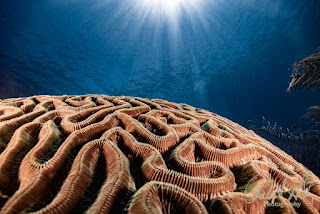
The Case Study Image: Starting Point
Let’s set the scene.
Location: Roatan reef
Depth: Approximately 40 feet
Subject: Diver moving through a coral structure
Lighting: Natural ambient light with slight haze
What the RAW File Looks Like

Strong blue/green color cast
Muted coral tones
Low contrast
Reduced clarity from water haze
Subject blending into the background
This is a very typical underwater RAW image.
And it’s exactly where the real work begins.
The Back-to-Basics Workflow (Always Follow This Order)
If you’ve been following the series, this will look familiar.
If not, this is the foundation:
White Balance
Exposure
Presence
Color
Masking
Final Adjustments
Let’s walk through the exact edit, step by step.Order is everything.
When you follow the correct sequence, each step builds on the previous one.
Step 1: White Balance – The Foundation

What’s Happening Underwater
At depth, red light disappears first. By 40 feet, your image is dominated by blue tones.
In Lightroom Classic (Develop Module)
Go to the Basic Panel:
Temp: Increase significantly (+1200 to +2500)
Tint: Add magenta (+10 to +25)
What You’ll See
Reds and oranges return
Skin tones normalize
Coral begins to look natural again
Pro Insight
White Balance is not a tweak.
It’s the foundation.
If this step is off, everything else will be a struggle.
Common Mistake
Trying to fix color using Saturation instead of White Balance.
This creates unrealistic, overprocessed images.
Step 2: Exposure – Rebuilding Light

Now that color is corrected, we fix the light.
Basic Panel Adjustments
Exposure: +0.3 to +0.7
Highlights: -30 to -60
Shadows: +30 to +60
Whites: slight increase
Blacks: slight decrease
Goal
Balanced tonal range, not brightness.
Use the Histogram
This is your most reliable guide.
Avoid clipping highlights
Avoid crushing shadows
Pro Insight
Exposure is not about making the image brighter.
It’s about restoring what the camera couldn’t capture correctly underwater.
Step 3: Presence – Restoring Depth and Detail

Presence Sliders (Basic Panel)
Texture: +10 to +20
Clarity: +10 to +20
Dehaze: +10 to +25
What This Does
Enhances micro-detail
Cuts through underwater haze
Adds depth to the water column
Important Rule
Small adjustments here go a long way.
Common Mistake
Overusing Dehaze and Clarity:
Creates halos
Makes water look unnatural
Adds harsh edges
Step 4: Color – Controlled Enhancement
Now that the image is balanced, we refine the color.
Vibrance vs Saturation
Vibrance: +15 to +25
Saturation: minimal or zero
HSL Panel (Color Mixer)
Focus adjustments on:
Reds: increase saturation and luminance
Oranges: refine coral tones
Blues: slightly reduce luminance for depth
Point Color (Latest Lightroom Classic Feature)
Use Point Color to:
Target specific hues precisely
Adjust without affecting the entire image
🔹 Important Rule
Color correction is not about increasing overall saturation.
It’s about targeted color control.
-
Adjust specific colors, not the entire image
-
Focus on restoring reds and oranges first
-
Maintain natural blue water tones
-
Avoid pushing colors beyond what you actually saw underwater

Pro Insight
This is where most underwater photos finally come to life.
Not because they are brighter, but because the color now feels natural and believable.
Common Mistake
Applying global saturation increases across the entire image.
This destroys natural color balance.
Step 5: Masking – Where the Image Comes to Life

Up to this point, every adjustment has affected the entire image.
Now, we take control.
Masking allows you to guide the viewer’s eye by enhancing your subject without overprocessing the background.
This is where a good image becomes a compelling one.
Start with Subject Selection
Use Lightroom’s AI Masking:
-
Select Subject
-
Refine the mask if needed
Then apply subtle adjustments:
-
Exposure: +0.2 to +0.4
-
Clarity: +5 to +10
-
Texture: +5
You’re not trying to make the subject brighter.
You’re trying to make it stand out naturally.
Balance the Background
Create a second mask for the background:
-
Slightly reduce Exposure (–0.2)
-
Lower Clarity or Dehaze just a touch
This creates separation and depth without looking artificial.
Enhance Directional Light
Use a Radial Gradient if needed:
-
Place it over your subject
-
Feather generously
-
Add a slight exposure lift
This mimics how light naturally falls underwater.
Pro Insight
Masking is not about making parts of the image “pop.”
It’s about controlling attention.
If the viewer instantly knows where to look, you’ve done it right.
Common Mistake
Over-masking.
Bright subjects, dark backgrounds, and heavy clarity create an artificial “cut-out” look.
If your edit feels obvious, it’s too much.
Step 6: Final Adjustments – Polishing the Image

This is the difference between adjusting a photo… and truly editing it.
Up to this point, we’ve built the foundation.
Now we finish the image with precision.
Final Refinements
Detail Panel
-
Sharpening: ~40
-
Masking: High (hold Alt/Option to isolate edges)
Apply sharpening only where it matters, edges and subject detail.
Avoid sharpening open water, this introduces noise and reduces clarity.
Noise Reduction
-
Use AI Denoise if needed
Especially for:
-
Deeper dives
-
Higher ISO images
-
Shadow-heavy scenes
Keep it controlled. Too much noise reduction softens important detail.
Lens Corrections
-
Enable Profile Corrections
-
Remove Chromatic Aberration
This ensures clean edges and accurate geometry, especially important for wide-angle reef scenes.
Crop & Composition
-
Straighten horizon
-
Improve framing
-
Remove distractions
At this stage, composition is about refinement, not rescue.
What You Should Be Seeing Now
Take a moment and look at your final image:
-
The subject stands out naturally
-
Colors are vibrant but believable
-
The water retains depth
-
Nothing feels overprocessed
That’s the goal.
Pro Insight
Great underwater edits are not dramatic.
They are controlled.
Small adjustments, applied in the correct order, create the biggest difference.
Common Mistake
Over-polishing.
Too much sharpening, too much clarity, too much noise reduction.
If the image starts to feel “crunchy” or artificial, you’ve gone too far.
🌊 Final Thought
The goal is not to make your photos look edited.
The goal is to make them look the way you remember the dive.
Before vs After: The Transformation

Before
Flat
Blue-heavy
Low contrast
No subject separation
After
Balanced color
Defined subject
Strong depth
Natural, realistic tones
This is the difference between capturing a moment and presenting it.
Common Mistakes to Avoid
Skipping White Balance
Editing out of order
Overusing Dehaze
Over-saturating colors
Ignoring masking
Practical Takeaways
Always start with White Balance
Build exposure carefully
Use Presence tools with restraint
Enhance color selectively
Use masking to create depth
Finish with subtle refinements
How This Fits Into the Back-to-Basics Series
This post brings together everything we’ve covered:
White Balance fundamentals
Exposure control
Presence tools
Color refinement
Masking techniques
This is the real-world application of the full workflow system.
Internal Linking Suggestions
Link to:
Back to Basics – Part 5A: White Balance
Back to Basics – Part 5B: Exposure & Tone
Back to Basics – Part 5C: Presence & Detail
Back to Basics – Part 5D: Color
Back to Basics – Part 5F: Masking
Back to Basics – Part 5G: Complete Workflow
Call to Action
Want to speed up your editing and get consistent results?
Download my free guide:
“10 Lightroom Fixes Every Underwater Photographer Should Know.”
👉 https://info.robertherb.com/lm-2-blog
👉
https://robertherb.blogspot.com/2026/03/editing-underwater-photos-lightroom-guide.html
Written by Robert Herb
Empowering underwater photographers to capture and enhance the beauty of our oceans since 1978.
Stay tuned for more in-depth insights into underwater photography. Let us dive deeper into the art and craft of capturing the marine world. I would welcome any comments or suggestions.
Get ready for an exciting underwater photography adventure. For more details on my upcoming online training course, check out my Training page at RobertHerb.com or email me at bob@robertherb.com.
Sincerely,
Bob Herb
|
|


Comments
Post a Comment
Please let me know your comments.